Did you know that more than half of all internet traffic comes from mobile devices? That’s right, people are browsing the web on their smartphones while waiting in line at the grocery store or even during their morning commute. So what happens when your WordPress website doesn’t display correctly on these tiny screens? It can lead to frustrated visitors bouncing off your site faster than a speeding bullet! But fear not, because in this easy-to-follow guide, we’ll show you how to fix those pesky display issues and make sure your WordPress site shines bright on every smartphone and tablet out there. Get ready to conquer the mobile world!
The importance of mobile optimization for websites
The increasing use of mobile devices to access the internet has made mobile optimization crucial for websites. Not only does it help deliver a seamless user experience, but it also improves the overall performance and visibility of a website. With so many people relying on their smartphones and tablets for browsing, it is essential for businesses to ensure that their websites are optimized for these devices.
Mobile optimization goes beyond just making a website look good on smaller screens; it involves restructuring the layout, optimizing loading times, and adapting content to suit smaller displays. By doing this, website owners can keep users engaged and prevent them from bouncing off due to slow loading times or unresponsive design. Furthermore, search engines like Google prioritize mobile-friendly websites in their search rankings, meaning that having a well-optimized site can significantly improve its visibility and organic reach.
In today’s highly competitive online landscape, having a mobile-optimized website is no longer an option but rather a necessity. As more consumers rely on their mobile devices for browsing and shopping, businesses must adapt accordingly. Investing in mobile optimization not only enhances user experience but also boosts SEO efforts and ensures that your website remains relevant in the ever-evolving digital marketplace. Prioritizing mobile optimization will set your business apart from competitors while catering to the growing number of users who prefer accessing the web on-the-go.

Understanding the problem: Common issues with WordPress on mobile
WordPress is one of the most popular content management systems used by website owners, thanks to its user-friendly interface and vast range of plugins and themes. However, when it comes to displaying correctly on mobile devices, WordPress can often encounter a host of common issues. One such issue is responsiveness. Many WordPress themes are not inherently designed to adapt to different screen sizes, causing elements to appear distorted or overlapping on mobile screens.
Another common issue with WordPress on mobile is slow loading times. Mobile users have limited patience when it comes to waiting for a website to load, so if your WordPress site takes too long, you could be losing potential visitors. This can be caused by bloated themes or poorly optimized images that are not resized accordingly for smaller screens. It’s important for website owners using WordPress to prioritize speed optimization techniques like caching, image compression, and minification to ensure a smooth experience for their mobile users.
Furthermore, navigation problems can also arise on mobile devices due to the limited screen space available. Complex menu structures may become difficult or frustrating for users as they struggle to find what they’re looking for easily. Website owners should consider implementing responsive menus that collapse into an easily accessible icon or dropdown menu on smaller screens.
Troubleshooting steps: How to fix display problems
When it comes to troubleshooting display problems on your WordPress site, there are a few key steps you can take to identify and fix the issue. First, start by clearing your browser cache and cookies. This can often resolve display problems caused by cached or outdated files.
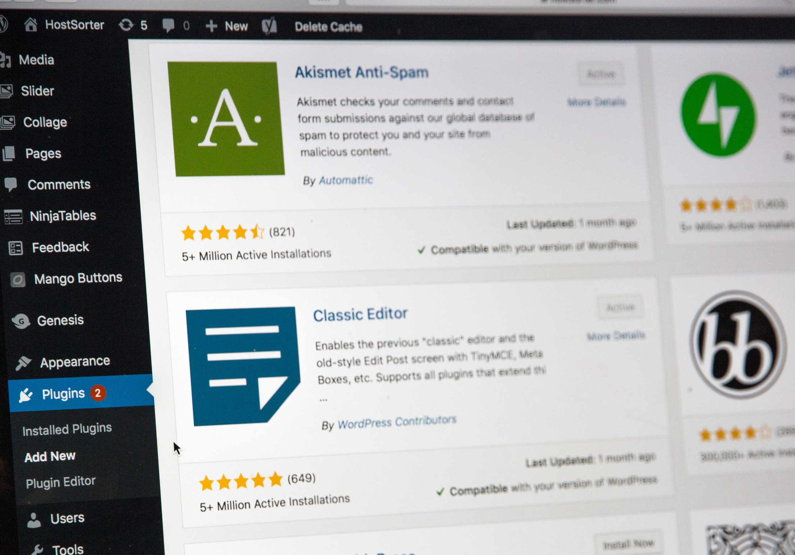
If that doesn’t work, try disabling any plugins and switching to a default WordPress theme. Sometimes, conflicts between plugins or themes can cause display issues. By deactivating them temporarily, you can narrow down the source of the problem.
Another common culprit for display problems is custom CSS code. If you have added any custom CSS to your site, try removing it temporarily to see if that solves the issue. Alternatively, you can try validating your CSS code using online tools such as W3C Validator to pinpoint any errors.
Remember, troubleshooting display problems requires patience and a systematic approach. By following these steps and methodically ruling out potential causes, you’ll be well on your way to fixing any pesky display issues on your WordPress site!

Optimizing your theme for mobile compatibility
Optimizing your theme for mobile compatibility is essential in today’s digital landscape where more and more people are accessing websites through their mobile devices. A responsive design that adjusts seamlessly to different screen sizes not only enhances the user experience but also improves your site’s search engine rankings.
To optimize your theme for mobile, start by choosing a responsive WordPress theme. These themes automatically adjust the layout of your website based on the device being used to access it. This eliminates the need for separate designs or plugins for mobile versions of your site, simplifying both development and maintenance.
Next, pay attention to font sizes and readability. Ensure that text is easily legible on smaller screens without requiring users to zoom in or strain their eyes. Aim for a clean and minimalist design that prioritizes important content while minimizing unnecessary clutter.
Finally, test your website rigorously across various devices and browsers to identify any layout issues or performance bottlenecks specific to mobile devices. Regularly monitor how users interact with your site using tools like Google Analytics to get insights into user behavior patterns, popular screen resolutions, and common navigation paths.
By optimizing your WordPress theme for mobile compatibility, you will provide an exceptional user experience regardless of whether visitors access your site from their smartphones or desktop computers. Stay ahead of the competition by ensuring that every element on each page responds effectively across all devices – this way your brand message will always shine through no matter how it’s accessed!
Testing and review: Ensuring proper display across devices
With the increasing number of devices and screen sizes available today, it is crucial to ensure that your website displays properly across all of them. This is especially important for WordPress sites, as they are designed to be responsive and accessible on various devices. One way to ensure proper display is through thorough testing and review.
Testing your website on different devices is a necessary step in ensuring its compatibility and responsiveness. It allows you to identify any issues or inconsistencies in the display across different devices, enabling you to make the necessary adjustments before your audience encounters them. By testing on a range of devices such as smartphones, tablets, laptops, and desktop computers, you can gain insights into how your site behaves on different platforms.
In addition to testing your website across various devices, it is also crucial to review the design elements and content layout for each screen size. What looks good on a desktop computer may not necessarily translate well onto a smaller smartphone screen. Therefore, it’s important to review how images resize, text wraps or adjusts its size proportionally, and whether navigation menus are easily accessible on smaller screens.
By employing comprehensive testing strategies combined with meticulous reviews across multiple device types, you can ensure that your WordPress site displays correctly regardless of the device used by visitors. This level of attention will greatly enhance user experience while maintaining consistency in design and functionality – key factors in attracting and retaining an online audience in today’s digital landscape.

Additional tips and best practices for mobile optimization
- Utilize Responsive Design: One of the most crucial aspects of mobile optimization is implementing a responsive design for your WordPress website. This means that your site will automatically adjust its layout and features to fit different screen sizes and resolutions. By embracing responsive design, you can ensure that your content looks great on any device, from smartphones to tablets. Additionally, having a responsive design can improve user experience by making navigation easier and increasing loading speed.
- Optimize Images: Images play a significant role in capturing users’ attention and enhancing the visual appeal of your website, but they can also slow down load times if not optimized correctly for mobile devices. To avoid this issue, make sure to compress images without compromising their quality before uploading them to your WordPress library. You can use plugins like Smush or ShortPixel that automatically optimize images upon upload. Also, consider using next-generation image formats like WebP or lazy loading techniques to further improve page performance on mobile.
- Keep Forms Simple: Filling out forms on a tiny screen is often frustrating for users, leading them to abandon the process altogether. To prevent this from happening, simplify your forms as much as possible by minimizing the number of required fields and using intuitive input options such as drop-down menus or checkboxes where applicable. Furthermore, provide clear instructions and error messages in real-time so that users are aware of any issues immediately rather than after submitting the form.
Conclusion: Importance of a mobile-friendly website
In conclusion, having a mobile-friendly website is more important now than ever before. With an increasing number of people accessing websites on their smartphones and tablets, it has become crucial for businesses to cater to this audience. Not only does a mobile-friendly website improve user experience and make navigation easier, but it also impacts search engine rankings.
Furthermore, a responsive website design ensures that your content looks great on all devices and screen sizes. This means that visitors can access your website from anywhere at any time without any issues. By providing a seamless browsing experience across different devices, you are more likely to engage and retain visitors, ultimately driving conversions.
Ultimately, investing in a mobile-friendly website is essential if you want to stay competitive in today’s digital landscape. It not only enhances user satisfaction but also boosts your online visibility and credibility. So take the necessary steps to optimize your WordPress site for mobile devices and reap the benefits of reaching a wider audience while giving them the best possible experience.


